04 Logo
Introduction
The logo is the most recognisable element of the Talent IQ identity. This section explains how to use the logo system correctly, including the wordmark, monogram, construction, clearspace and colourways.
DOWNLOAD ASSETS
Logo
The Talent IQ wordmark pairs a handwritten, joined-up “talent” with a clean, rounded “iq”. Together they express exactly what we do: human insight plus hiring intelligence. Set entirely in lowercase, it feels approachable and personal, like a note written in the margins, and it sits at the centre of everything we create.

Logo System
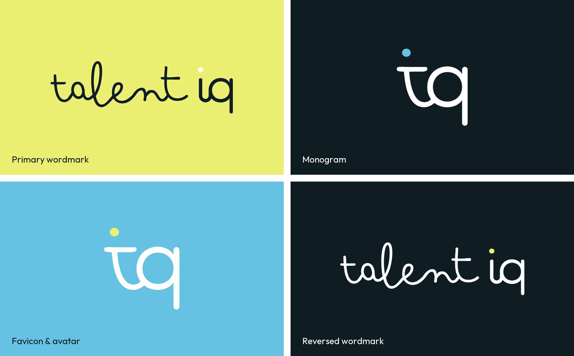
The Talent IQ logo system includes the primary wordmark, the “iq” monogram and a favicon/avatar version. Use the wordmark wherever there is room to breathe, and the monogram for small spaces, profile pictures and app icons.
Logo Construction
The wordmark combines two voices: “talent” is drawn as one continuous handwritten stroke, while “iq” is a rounded sans that brings clarity. The dot on the “i” carries a single pop of brand colour. Never redraw, retype or separate the two parts.

Clearspace
Always surround the logo with clearspace equal to half the height of the wordmark (x) so it has room to breathe. The minimum size is 100 px wide for digital applications and 25 mm for print, to keep the handwritten strokes legible.

Logo Usage
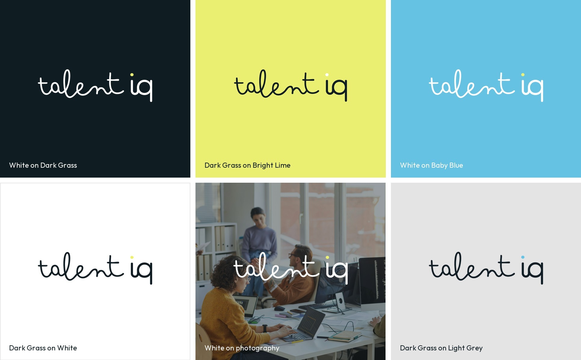
Use the logo on approved backgrounds only: white on Dark Grass or Baby Blue, and Dark Grass on Bright Lime, White or Light Grey. On photography, use the white wordmark over a calm, uncluttered area. Never stretch, recolour, outline or add effects to the logo.